About Infocon components
The Infocon component is a specialized container-type component used to display tile forms in a flexible "pullout" format. This component can be set to:
- Expand and collapse, to show many tiles or a single tile
- When collapsed, display either a single value from the selected record or the entire tile
- Expand the display in any of four directions, so as to view multiple tiles
- Limit the number of tiles that display when expanded
- Provide the option to scroll and see more tiles, if there are more tiles than the viewable space can display at once
- While in the expanded state, allow users to select a single tile by clicking it, which then collapses the display again
Infocon structure and functionality
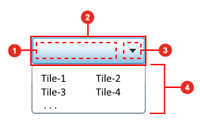
This diagram illustrates the basic structure and functionality of the Infocon component:

- Selected content area:
This area is where the content for the selected record displays.
What actually displays here depends on the Display Selected Item As property for the infocon component. If that property is set to Text, then the value that displays here is taken from the first display field in the selected tile. If the Display Selected Item As property is set to Tile, then this area displays the entire first tile.
Note that the tile is not resized to fit the available space. If it is too large, it is simply truncated. So, you must take care when defining the width and height for the infocon component, to make sure that the tile can display if the Tile option is selected. This means that the infocon must be sized larger than the tile form it is being used to display.
- Infocon header: This is
the area that displays at all times. This area includes both the
Selected content area and
the
Drop-down arrow.
When the infocon is displaying in the collapsed state, the header is all that displays. When the infocon is in the expanded state, the Expanded display area also displays.
- Drop-down arrow: This
button toggles the infocon back and forth from the collapsed state to the
expanded state.
This button functions much like the drop-down arrows used in ComboBox and DropList components.
- Expanded display area:
This area displays only when the infocon is in the expanded state.
This area can extend beyond the borders of the Infocon header area in any direction, depending on how the Tile Direction property is set for the infocon. In all cases, this display area "floats" above all other form content. The size of this area is specified by settings in the Tile Direction, List Columns, and List Rows properties for the infocon.
When a tile is selected, this area closes, and the selected tile is displayed in the header.
Designing Infocon behavior
When designing forms to work with infocon components, it is helpful to keep in mind that the Tile Dirrection, List Columns, and List Rows properties interact to define the infocon's appearance and behavior.
When Tile Direction is Right or Left
These are the general rules for Infocon behavior when the Tile Direction property is set to Right or Left. Note that these rules might not apply, depending on the size and placement of the Infocon component within the form.
- The height of the expanded display area (see previous section) is determined by the List Rows property. The number specified there determines the number of whole tiles that display top-to-bottom.
- If all tiles returned do not fit within the available expanded display area, a horizontal scrollbar provides access to the rest of the tiles.
When Tile Direction is Down or Up
These are the general rules for infocon behavior when the Tile Direction property is set to Down or Up. Note that these rules might not apply, depending on the size and placement of the Infocon component within the form.
- The width of the Expanded display area (see previous section) is determined by the List Columns property. The number specified there determines the number of whole tiles that are displayed side-by-side. If necessary, a horizontal scrollbar is used.
- If all tiles returned do not fit within the available Expanded display area, a vertical scrollbar provides access to the rest of the tiles.
- If horizontal expansion is required, the Expanded display area always expands to the right.
Miscellaneous other comments on Infocon behavior
These are some other notes and comments about Infocon behaviors:
- Tile images can be loaded using "Just In Time" processing. For the smart client, this depends on the tile definition. For the web client, the images are always loaded after the tiles are initially retrieved and rendered. The images then appear in the tiles as they are loaded.
- Previous sections have
noted that the general rules might not apply, depending on the size and
placement of the Infocon component within the form.
For example, in cases where the Tile Direction property has been set to Down, if the Infocon component is located near the bottom of the form, it actually displays the Expanded display area as though the Tile Direction is set to Up.
Typically, the underlying logic first tries to display the popup panel with the requested direction and size (the List Columns or List Rows properties). If that fails, it tries the opposite direction, still with the requested size. If that fails, scrollbars are introduced and the size is reduced.
In some cases, the Expanded display area can even overlap the header (see the section on Infocon structure and functionality).
This is seen most often in the web client, because the limitations of the browser window are more stringent.
- In the web client only, the tile forms themselves can have buttons and hyperlink button components. These components trigger their events if the named event handler is defined on the host form. The Infocon processing logic guarantees that the tile that contains the clicked button is selected before the event is triggered.