About FlexLayout components
A FlexLayout component is a container component which is used to flexibly house other components. Each FlexLayout component can be divided into different horizontal or vertical regions, and each region can contain multiple child components. The overall positioning of those child components is specified by the FlexLayout region attributes, and their order is specified by the Sequence property.
You can nest FlexLayout components inside regions of other FlexLayout components. You can nest these components as many levels deep as you need to accomplish your form design.
A FlexLayout component can be customized by using the properties that are described in this topic.
FlexLayout container types
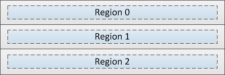
When using multiple regions, the FlexLayout component can group the regions horizontally or vertically.
Horizontal Box

Vertical Box

Region length
The Length and Units attributes control the individual length of each region of a FlexLayout component. Length is expressed as a number of characters, equal portions of the total available width (Flex units), or as a combination of both.
Char units only

Flex units only

Combination of Char and Flex units

About the Orientation, Pack, and Align attributes
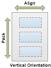
The Orientation attribute specifies whether child components are arranged vertically or horizontally within each region.
The Pack and Align attributes work together to position the child components within the region.
Vertical Orientation
When the FlexLayout region is vertically oriented, use Align to position the child components at the left, center, right, or to stretch them to fill the entire width of the region. Use Pack to position the child components at the start (top), center (middle), or end (bottom) of the region.

Horizontal Orientation
When the FlexLayout region is horizontally oriented, use Align to position the child components at the top, middle, bottom, or to stretch them to fill the entire height of the region. Use Pack to position the child components at the start (left), center (middle), or end (right) of the region.

VisibleWhen
The VisibleWhen attribute specifies the conditions under which the component is visible or hidden.
Animation
The animation attribute is used to add a sliding and/or bouncing effect to a region when it is opened or closed. Leave the field blank to disable animation, or select from these options:
- FromRight
- FromLeft
- FromTop
- FromBottom
- FromCenter
- FromRightWithBounce
- FromLeftWithBounce
- FromTopWithBounce
- FromBottomWithBounce
- FromCenterWithBounce
Background image
The Background Image attribute is used to add an image to the background of a region.
Minimum/Maximum length
When a region size is defined as a number of flex units, use the Min/Max attribute to specify the maximum and minimum possible size of that flex region.
Region margins
The Default Margin property specifies the margin, measured in WinStudio characters, that defaults for any child components added to the current FlexLayout region.
The Margin property is used to override, if necessary, the Default Margin property for components contained in the FlexLayout region.